

Marshoo
Designing for One Restaurant, Building for Many
- Role
- Sole Product Designer
- Duration
- 2 weeks
- Collaboration
- 2 backend developers, 2 frontend developers, 1 product manager
- Outcome
- Launched a restaurant website with online ordering, reservations, customer accounts, and flexible payments, supported by a reusable design foundation for other restaurant brands.
Project Overview
Marshoo began as a client project to design an online ordering experience for a restaurant. However, the company's goal extended beyond a single client: the product needed to be adaptable and reusable for other restaurants with different brands and business needs. The challenge was to create a distinctive experience for Marshoo while maintaining the flexibility, consistency, and development efficiency needed for future implementations.
Role & Constraints
Product Designer · Sole Designer
I owned the end-to-end product design process, from defining user flows and designing responsive interfaces to shaping MVP priorities and evaluating product trade-offs. Working closely with frontend and backend developers, I assessed the technical feasibility and implementation cost of design decisions, balancing user needs, business goals, and development constraints. This included exploring solutions such as split payments between wallet balance and online payment gateways, where a simpler user experience had to be weighed against technical complexity.
Reusability
Designing for Marshoo while ensuring the product could be adapted to other restaurant brands without rebuilding the experience.
Technical Feasibility
Working within existing development capabilities and evaluating proposed interactions with frontend and backend teams.
MVP Scope
Prioritizing essential features while avoiding unnecessary complexity, development time, and cost.
Designing for Adaptability
Balancing Brand Customization with Product Consistency
Marshoo needed a distinct brand experience, while the underlying product had to remain reusable across different restaurants. I approached this by keeping section layouts consistent while making images, content, logos, and brand colors configurable. Rather than introducing flexible layouts for every restaurant, I prioritized a shared structure to reduce development complexity and keep the MVP cost-effective.
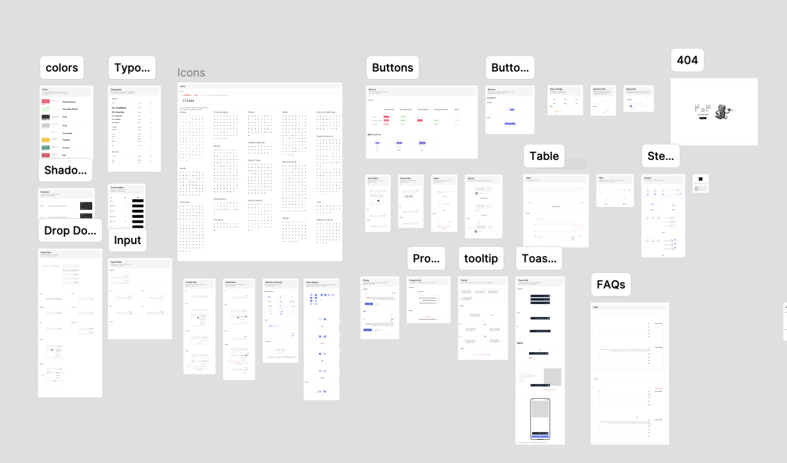
Building a Reusable Design System
To support this approach, I created a component library in Figma with reusable UI elements, component variants, and a consistent color system built with shared styles and semantic variables. By maintaining consistent token names and roles, the interface could be adapted to different restaurant identities through color updates, without redesigning individual components. The frontend team translated the reusable Figma components and shared color tokens into a consistent, maintainable UI system that could be adapted to different restaurant brands without redesigning individual components.

Making Food Ordering Intuitive
Reducing Friction from Browsing to Checkout
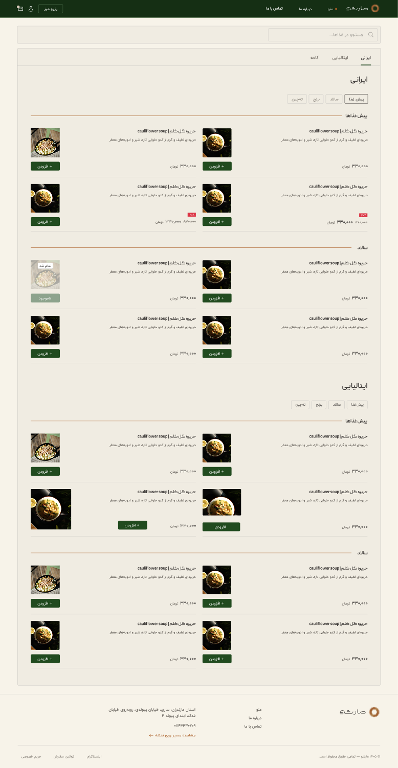
Food ordering is often driven by appetite and spontaneous decisions. I wanted to create an experience where customers could explore the menu naturally, discover dishes without unnecessary interruptions, and move toward checkout with minimal friction.
Continuous Menu Exploration
Rather than separating food categories into tabs that hide other items, I kept the full menu on a single scrollable page. Category navigation acts as an anchor system, allowing customers to jump directly to a section while keeping the rest of the menu accessible through continuous scrolling. This approach supports both intentional browsing and spontaneous discovery, without requiring users to repeatedly switch between categories.
Food Information, in the Right Order
I designed compact, RTL-friendly product cards with the dish name and key information on the right and the food image on the left. Optional descriptions appear beneath the title in a lighter visual hierarchy, keeping the cards consistent even when restaurants provide different amounts of content. Rather than introducing a dedicated product page for every dish, tapping the image provides a larger view, keeping the browsing experience focused and lightweight. I used a conditional interaction to keep the ordering flow lightweight. Products without add-ons could be added directly to the cart, while products with optional add-ons opened a customization modal with simple on/off selections.
A Cart That Stays Close
Customers can add items, review their cart, and adjust quantities without signing in. On desktop, the cart opens in a side drawer. On mobile, I adapted the interaction into a bottom sheet, making better use of the limited screen width while allowing customers to return easily to the menu. The goal was to preserve browsing context and avoid unnecessary navigation between pages.
Authentication at Checkout
I kept account authentication out of the browsing and cart experience, introducing it only when customers were ready to place an order. The checkout was structured around three stages: authentication, order information, and payment. Returning customers could continue with their existing information, while new customers could complete the required details after identification. This progressive approach kept the early ordering experience lightweight without removing the information needed to complete a purchase.
Balancing User Needs with MVP Constraints
Reservation Requests without Unnecessary Verification
During MVP planning, the development team raised concerns about spam and fraudulent reservation requests, proposing mandatory phone verification. I challenged this requirement because the reservation feature was designed to collect requests, not instantly confirm bookings. Adding OTP verification would introduce unnecessary friction to a simple process. After reviewing reservation flows on other restaurant websites and discussing potential risks with the development team, we agreed on a lighter approach: allowing guests to submit reservation requests without authentication, while protecting the form with CAPTCHA and rate limiting. The final solution was implemented without OTP, keeping the booking process straightforward while introducing safeguards against automated abuse.

Payments across Wallet and Gateway
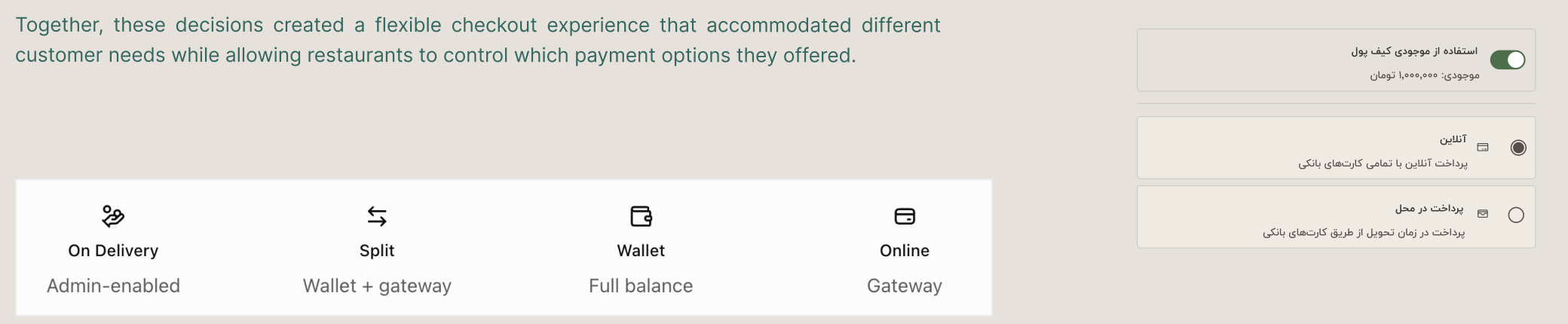
One of the checkout challenges was accommodating different payment scenarios without making the experience unnecessarily complicated. I designed a payment flow that supported three wallet balance states: no balance, partial balance, and sufficient balance to cover the full order. The partial-balance scenario required combining wallet funds with an online payment gateway, introducing technical complexity that I evaluated with frontend and backend developers. The final implementation supported full online payments, full wallet payments, and split payments, allowing customers to use their available balance without requiring a separate top-up. I also incorporated Pay on Delivery as an optional payment method, available only when enabled by the restaurant administrator. Together, these decisions created a flexible checkout experience that accommodated different customer needs while allowing restaurants to control which payment options they offered.
Payment Failure Recovery
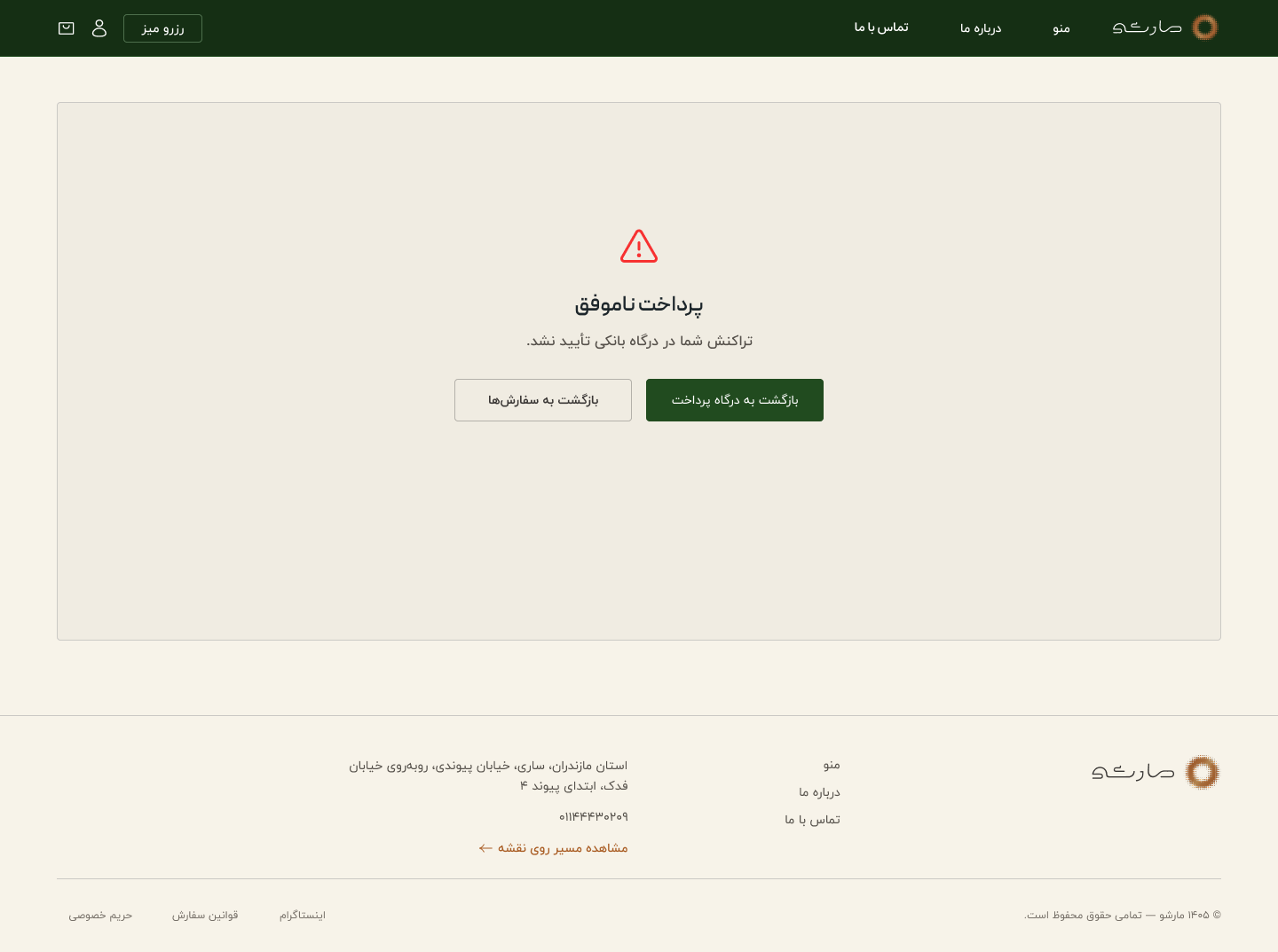
During checkout design, I explored ways to help customers recover from failed or canceled payments without losing their progress. Due to the existing backend architecture, the shopping cart could not be preserved after an unsuccessful payment. To address this limitation, I designed a dedicated payment failure screen with two clear actions: Retry Payment, which takes customers directly back to the payment gateway, and Back to Orders, where they can review their order history. Canceled orders remain visible in the order history, while a separate Reorder action allows customers to repeat previous purchases, including completed orders. Although the cart could not be retained, the recovery flow provided clear next steps and reduced the effort required to retry a payment.
One Restaurant. A Reusable Foundation.
Marshoo launched as a fully functional restaurant website, bringing together online ordering, reservations, customer accounts, and multiple payment options. Beyond the initial launch, the project established a reusable design foundation, with configurable content and shared components that could support future restaurant implementations. Working on Marshoo reinforced the importance of balancing user experience with technical feasibility and development costs, particularly when designing a product intended to serve more than one business.