

Hamsarmaye
Making a Complex Investment Platform Easier to Navigate.
Tokenized real estate, interconnected investment journeys, and an interactive, animated landing page.
- Role
- Product Designer & Brand Identity Designer
- Duration
- 8 weeks
- Collaboration
- 3 backend developers, 1 frontend developer
- Outcome
- Delivered the platform experience across investment offerings, trading, dashboard, wallet, verification, fundraising, and homeownership, alongside brand identity and an interactive, animated landing page.
Project Overview
Hamsarmaye is a real estate investment platform that allows people to participate in property and construction projects through tokenized ownership. It also gives property owners a way to offer ready properties or construction projects for fundraising and investment.
The platform brings together primary offerings, secondary trading, personal asset management, and a separate homeownership program. One of the main design challenges was making these interconnected experiences understandable without hiding the complexity users need to make informed financial decisions.
Role & Constraints
Product Designer & Brand Identity Designer
I worked across the product experience, from reviewing business requirements and defining user flows to designing responsive interfaces, information hierarchies, and interaction states. I collaborated with frontend and backend developers to understand how property data, offering stages, transactions, and verification requirements affected the interface.
My work included the property and offering experiences, primary and secondary markets, dashboard, wallet, bank account management, homeownership flow, property-owner tools, and a redesign of the public landing page.
Key Constraints
- Complex relationships: One property could have multiple primary offerings and secondary market activities, sometimes active at the same time.
- Different contexts: Public property exploration, individual offerings, trading, and asset management needed different information and actions.
- Financial requirements: Identity verification, bank ownership checks, wallet balances, and trading restrictions needed clear feedback.
- Existing product: Improvements had to fit the platform’s technical and business rules, with the landing page redesign preserving the existing backend.
Structuring a Complex Investment Platform
Separating Properties from Investment Opportunities
A key challenge was distinguishing a property from the investment opportunities associated with it. Discussions with the backend team clarified that a single property could have several primary offerings and secondary market activity. Treating them as one item in the interface would make it difficult to show what users were actually viewing or entering.
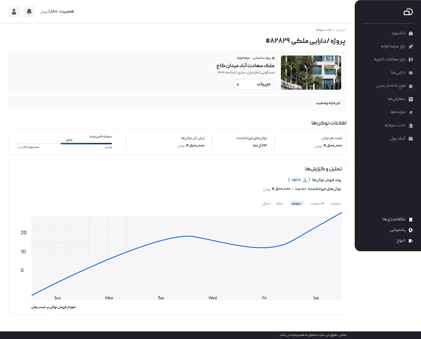
I approached this by separating two card types based on their purpose. Property cards represent the asset itself and lead to a public property detail page, where users can explore the property’s information and its associated primary offerings and secondary market opportunities. Primary offering cards represent a specific fundraising opportunity and direct users to that offering’s market experience.
The distinction was not simply a visual state change. Each card represents a different entity, answers different questions, and leads to a different destination.
Handling Multiple Offering and Market States
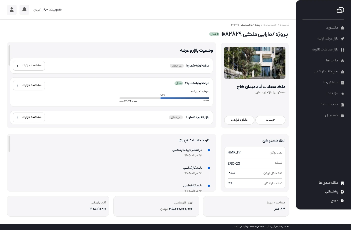
An early challenge was how to communicate a property’s lifecycle. A simple linear sequence was not enough: a second primary offering could start while secondary trading for the same property was already active.
Rather than relying on one overall market status for the property, I organized offering and market information independently. The property-level view could summarize multiple opportunities, while each offering retained its own stage, status, progress, and destination. I also explored a property history timeline to communicate important events without suggesting that all market activities must happen one after another.
This helped establish a clearer distinction between the property’s overall status and the status of each investment opportunity.
Making Navigation Match the User’s Intent
The same property can appear in several parts of the platform, but the next action should depend on the context. Someone exploring a public property catalog needs to understand the asset and its opportunities; someone browsing primary offerings is choosing a fundraising opportunity; someone entering the secondary market is preparing to trade.
I used context-specific navigation rather than relying on a generic “Details” action everywhere. Public property cards lead to the property overview, primary offering cards lead to the corresponding offering, and secondary market listings lead to the trading experience.
This separation kept the journeys related without making their destinations interchangeable.
Making Investment Decisions Clearer
Designing Primary Offering Cards for Quick Comparison
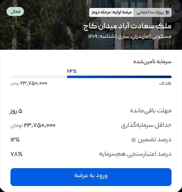
I designed the primary offering cards to help investors scan and compare opportunities without overwhelming them with information. The client did not want property photography to dominate the experience, so I kept images visually secondary. Their main role was to help users recognize and distinguish properties while browsing.
I chose a simple linear progress bar to communicate how much funding had been secured toward an offering’s target. Rather than adding a more elaborate visualization, I prioritized a familiar, easy-to-read indicator.
Each card also presents four decision-related details: remaining time, minimum investment, guarantee percentage, and Hamsarmaye’s assessment score. The card identifies whether the underlying asset is a construction project or a ready property, and shows the primary offering stage and status, such as active, inactive, or completed.
The goal was a consistent hierarchy in which investment information, not decoration, receives the most attention. This card design applies to primary offerings, not secondary market trading.
Communicating Upcoming Offerings
Some offerings needed to appear before their scheduled launch. I explored a countdown that shows the time remaining until the offering begins, while an active offering shows funding progress and the time left to participate.
Instead of designing two unrelated cards, I kept the overall layout and key investment information consistent, changing only the status-specific module and action. This made upcoming and active opportunities easier to recognize as different states of the same type of offering.
Designing the Secondary Trading Experience
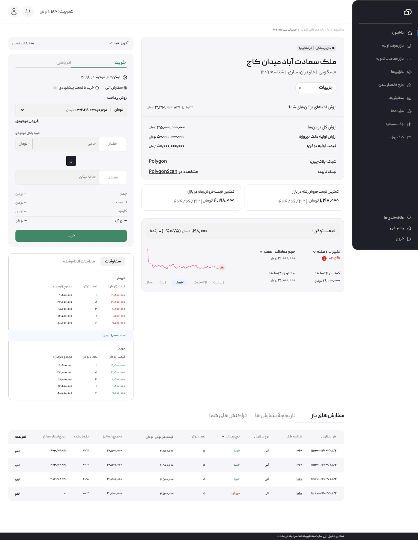
Unlike primary offerings, the secondary market required a transaction-focused experience. Investors needed to review prices, market movement, available orders, and their own activity before buying or selling property tokens.
I designed a dedicated trading interface that brings together market information and buy/sell controls. Users can trade at an available market price or submit an order at a price they choose, to be matched when a compatible order becomes available.
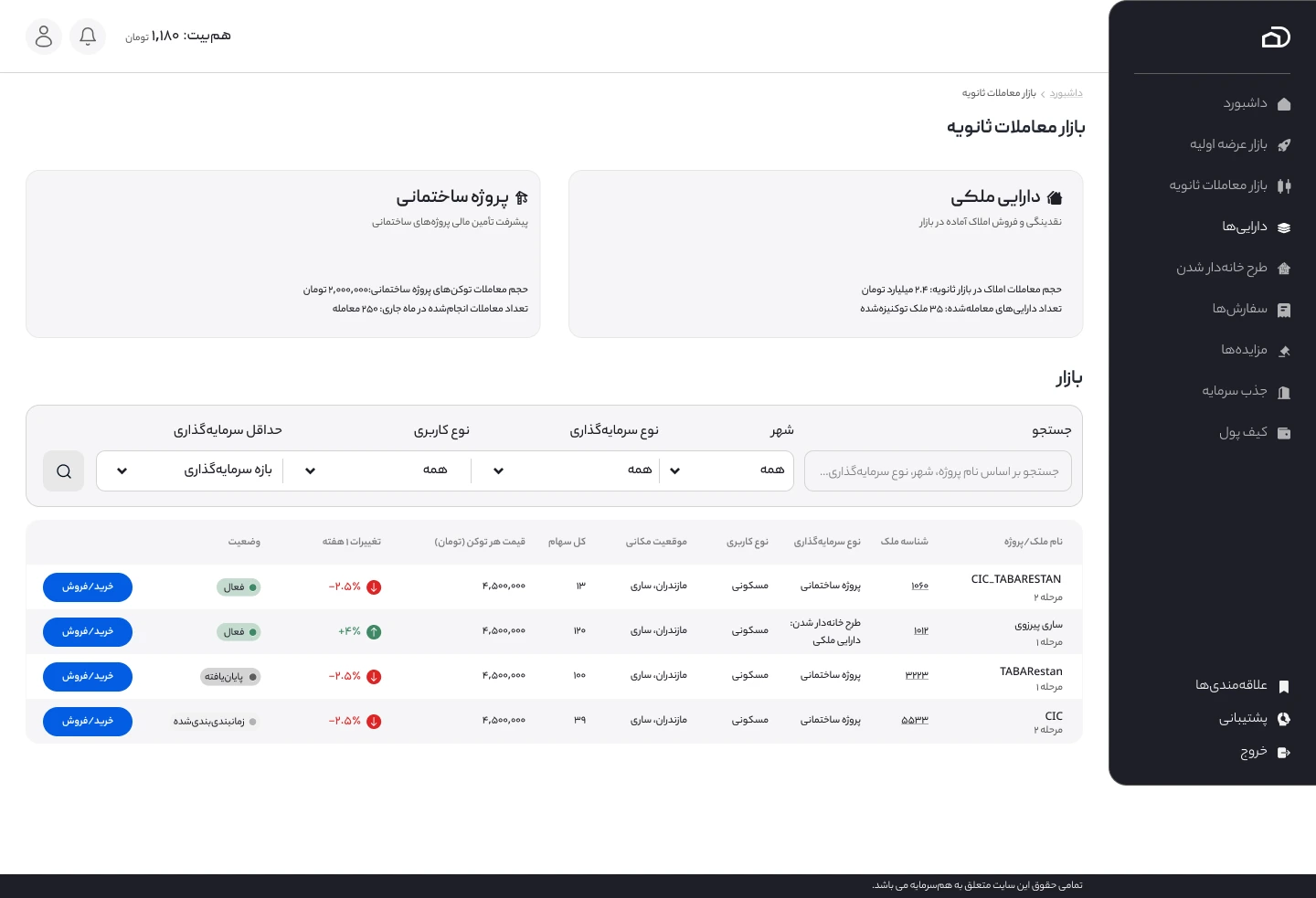
The market listing also prioritizes trading-related information, such as token price, weekly change, and trading status. The offering stage remains available as context, but it is not the most important information for someone comparing market opportunities.
The goal was to make trading information accessible without mixing it into the public property overview or the primary offering experience.
Clarifying Transaction Conditions
Investment transactions include rules and limitations that users need to understand, such as purchase limits and applicable fees. I explored presenting these details through a clear “View transaction conditions” action near the purchase flow, with a separate information view rather than a misleading confirmation checkbox.
I also considered short contextual explanations for fees, so users could access the meaning of a charge without adding lengthy text to the transaction form.
Supporting Ongoing Investment
Reorganizing the Dashboard and Navigation
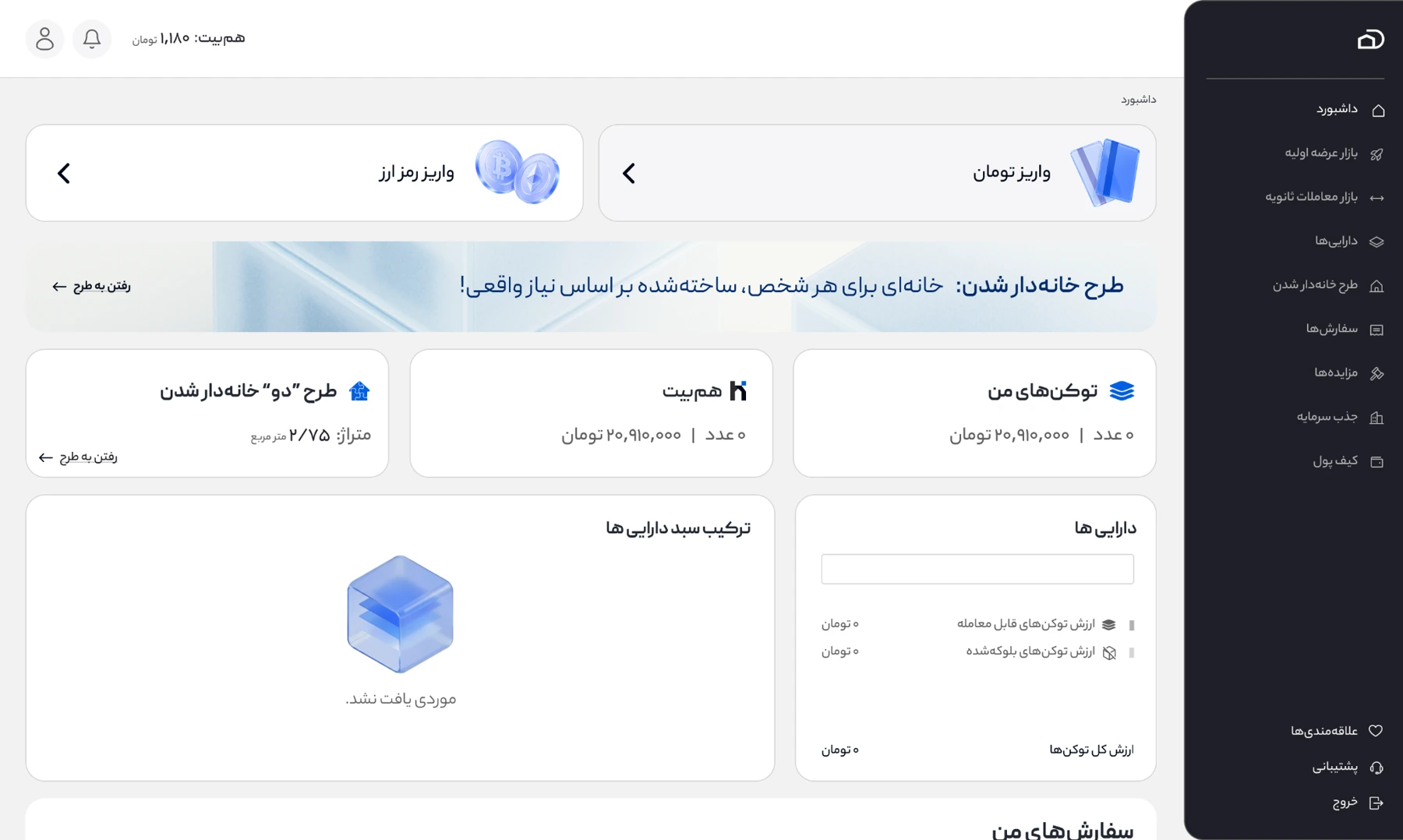
I reorganized the shared sidebar around the platform’s primary activities, separating the primary offering market, secondary trading, and users’ own assets. The same navigation structure is available to investors and property owners, avoiding separate menus for each audience.
On the dashboard, I prioritized fiat and cryptocurrency deposits as quick actions at the top of the page. These actions take users directly into dedicated deposit flows, rather than requiring them to find the wallet section first. Below them, I organized token holdings, Hamsarmaye balance, homeownership progress, and portfolio information.
I also designed both empty and populated portfolio states. The empty state communicates that no holdings are available; the populated state presents portfolio composition and relevant asset information.
Designing the Wallet Experience
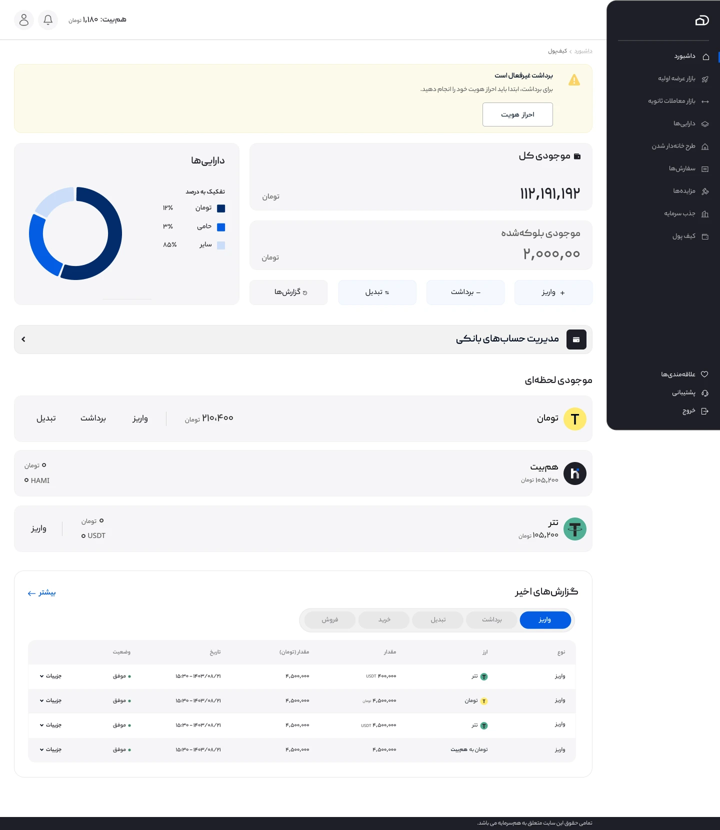
I designed the wallet interface to bring different financial activities into one understandable place. It presents total and blocked balances, the composition of assets, currency-specific holdings, deposit and withdrawal actions, and transaction history.
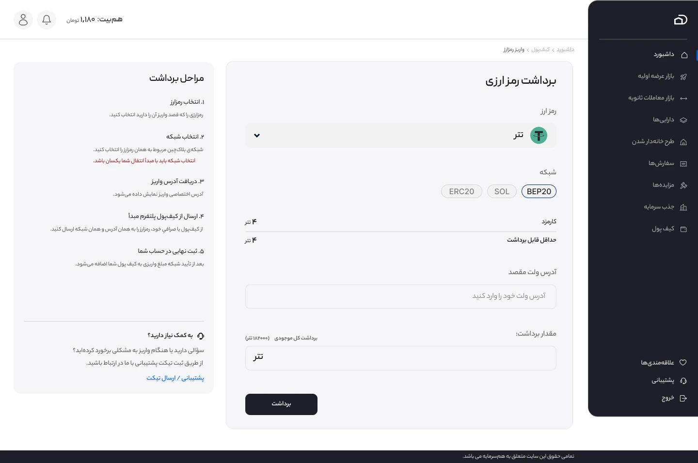
Deposit and withdrawal processes use dedicated screens so users can focus on the details of each transaction. In the cryptocurrency withdrawal flow, for example, the interface separates currency and network selection, destination wallet address, amount, fees, and the withdrawal action. Supporting guidance explains the steps and warns users to select a compatible network.
The aim was to make the available actions and financial information easier to find while giving more complex transactions the space they require.
Making Identity and Bank Verification Understandable
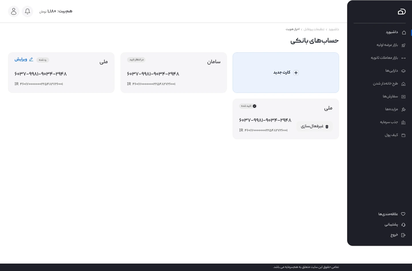
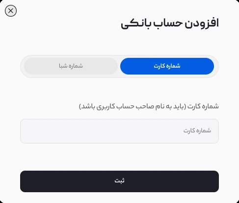
Financial activities on Hamsarmaye require identity and bank account checks. The registration flow collects the user’s national ID, and the bank account management interface lets users add a card number or IBAN. The system checks whether the bank account belongs to the registered identity.
I designed the account management cards, the add-account modal, and the feedback states for verification. Users can see whether a bank account is approved, pending, or rejected. When the information does not match, the interface shows an error, and the user can edit the details and try again.
I also designed verification-related restrictions and feedback, including pending and rejected identity submissions and clear guidance when an action such as withdrawal is unavailable until verification is complete.
Designing a Guided Homeownership Experience
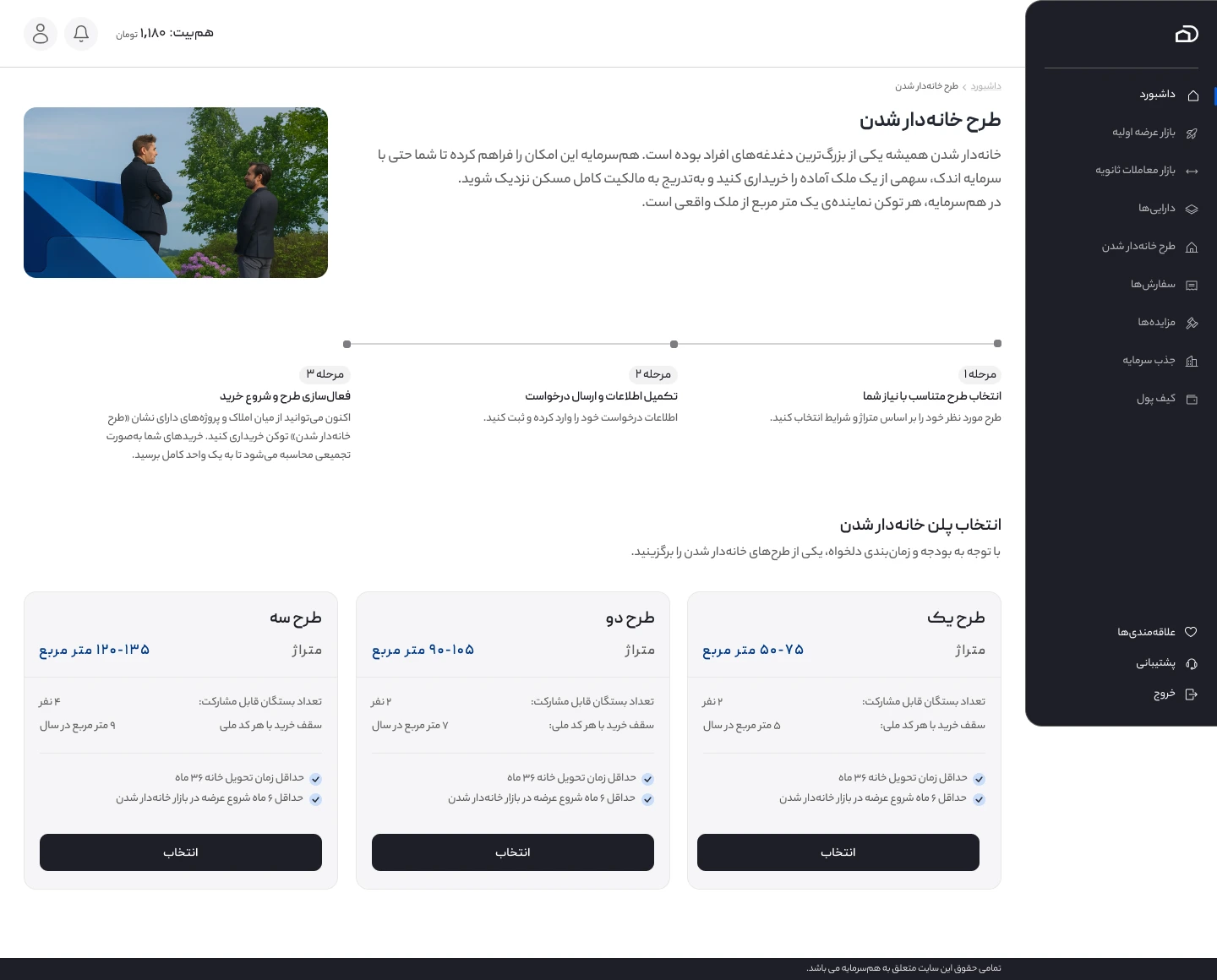
Hamsarmaye also includes a homeownership program that allows participants to build toward a target amount of residential floor area through eligible property-token purchases. The business requirements included different plans and the ability to involve eligible family members.
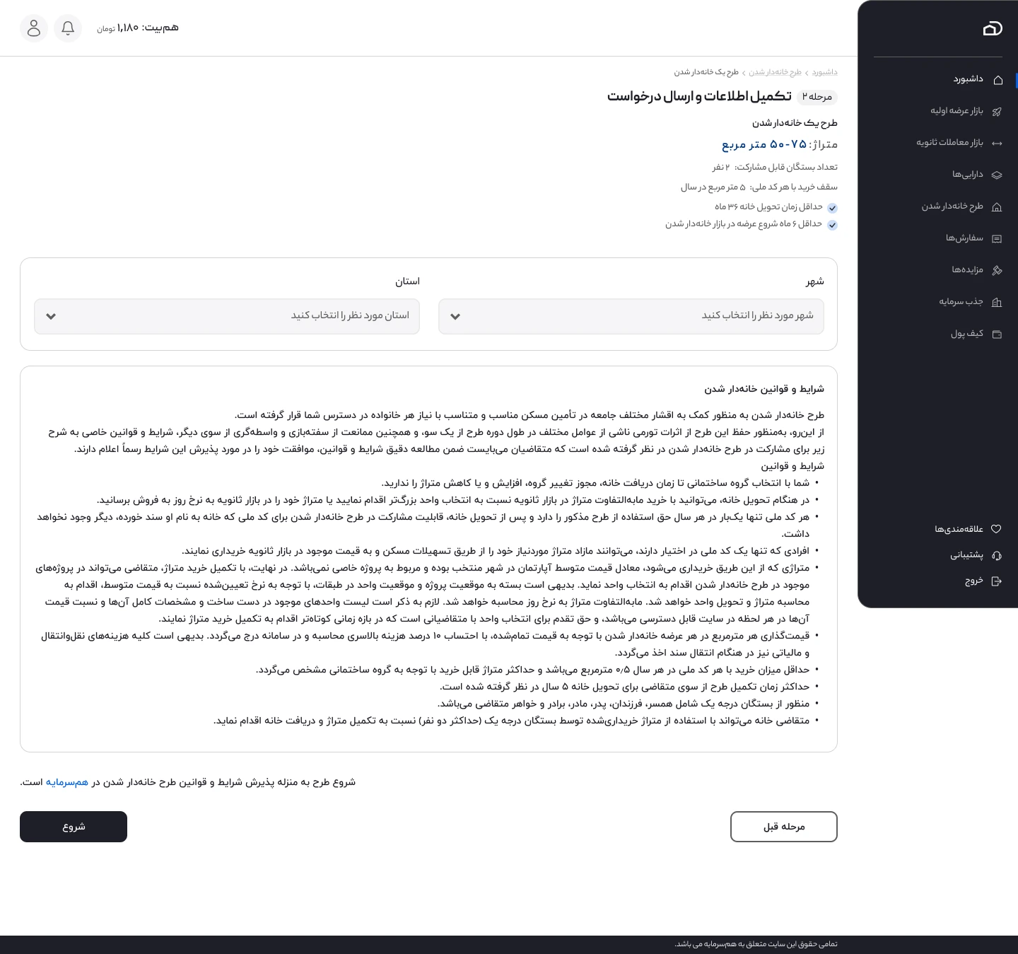
I structured this into a guided flow: selecting a plan, reviewing its conditions and submitting the required information, and then following progress within the homeownership area. The plan selection compares options using details such as target floor area, eligible relatives, annual purchase limits, and delivery conditions.
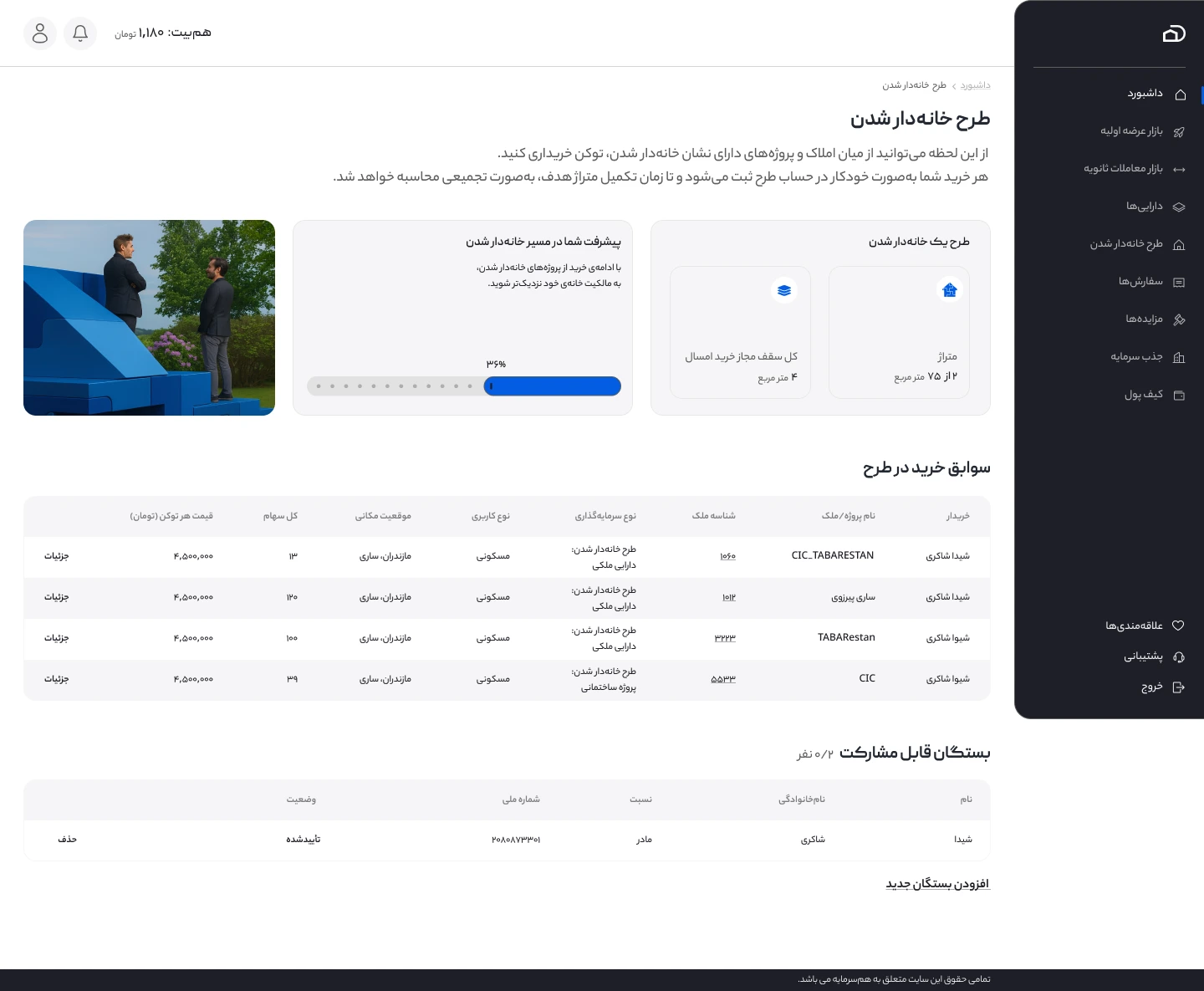
After enrollment, the interface brings together progress toward the selected goal, purchase history, and participating family members. The focus was to make a less familiar investment concept easier to follow through a clear sequence and an understandable progress view.
Supporting Property Owners and Fundraising
Property owners need a different view of the same underlying system. I designed interfaces for reviewing registered properties, tracking multiple primary offerings and secondary market activities, and seeing key information such as token details, offering status, and fundraising progress.
I kept property-level information separate from offering-specific financial activity. This helped property owners see both the asset as a whole and the individual opportunities associated with it, without treating each new offering as an entirely new property.
Brand Identity
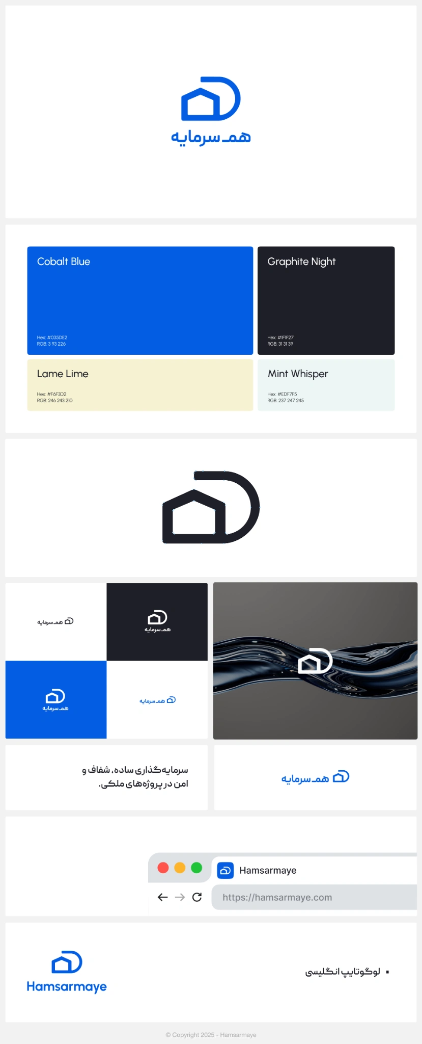
Alongside the product experience, I designed Hamsarmaye’s visual identity. The identity brings together the logo, Persian and English wordmarks, a defined color palette, and variations for light and dark backgrounds.
The visual system includes Cobalt Blue, Graphite Night, Lame Lime, and Mint Whisper, with examples showing the identity across digital applications.
An Interactive, Animated Landing Page
The public landing page was designed as an interactive, animated experience, extending the product work into the way people first discover Hamsarmaye.
Alongside clearer messaging and information hierarchy, interaction and animation formed part of the landing page experience.
I also redesigned the public-facing landing page, focusing on clearer messaging, a more consistent visual identity, and a better hierarchy between investment opportunities, platform benefits, and services for investors and property owners.
The redesign retained the existing backend and concentrated on the interface and presentation layer. This allowed the public experience to evolve without making the landing page redesign dependent on a broader backend rebuild.
Outcome & Reflection
The work established a more coherent design direction across property discovery, primary offerings, secondary trading, dashboard, wallet, verification, fundraising, and homeownership journeys. It also clarified how property-level information should relate to offering-specific and transaction-specific experiences.
The most valuable lesson was that a complex financial product cannot be made clearer through visual polish alone. Understanding the underlying entities, business rules, and user intentions was essential before deciding what information belonged on each screen and what action should follow.
Working on Hamsarmaye strengthened my ability to structure interconnected product flows, prioritize financial information, and collaborate with developers while balancing business requirements and interface clarity.